Css forced word wrap. Wrapping long words with CSS
The internet is made up of content, content is made up of words, and words can be very, very long. And sooner or later, a webmaster is faced with the problem of long words hyphenation. This problem is especially true for responsive design, and for small blocks of content. So how do you deal with this problem?
Hyphen
The first solution to hyphenate long words is with a hyphen.
Defisi (-webkit-hyphens: auto; -moz-hyphens: auto; -ms-hyphens: auto; hyphens: auto;)
Browser Support: CSS hyphens are supported by almost all modern browsers except Chrome, Opera, Android. Also, very often a hyphen is inserted in places that are grammatically wrong.
Break word
Word break is a CSS property that specifies whether to break lines within words.

Obriv-slova (-ms-word-break: break-all; word-break: break-all; word-break: break-word;)
Browser support: Word break is supported in all browsers except Opera Mini and older versions of Opera.
Overflow wrapper
The next solution is to use overflow-wrap.
Obertka-perepolneniya (word-wrap: break-word; overflow-wrap: break-word;)
Browser Support: Supported in almost all browsers. Note: Some browsers require the use of "word-wrap" instead of "overflow-wrap".
Ellipsis
Another option is to use ellipsis.
Mnogotochiye (overflow: hidden; white-space: nowrap; text-overflow: ellipsis;)
Browser Support: Supported by all modern browsers.
This is a working method, but far from ideal.
Final solution: Using the Overflow and Hyphen Wrapper.
Finalnoye-resheniye (overflow-wrap: break-word; word-wrap: break-word; -webkit-hyphens: auto; -ms-hyphens: auto; -moz-hyphens: auto; hyphens: auto;)
This solution will allow the browser that supports it to insert a hyphen and, for non-supporting browsers, insert a line break.
Determine how to wrap long words:
- only where there is a dash, space, or Enter (excl., non-breaking space and non-breaking hyphen -). A hyphen is written between parts of one word (for example, red and yellow), between words - a dash. "Soft hyphen" - appears only when hyphenation is necessary. If the word is outside the scope of the parent, then
or transfers part of it without a dash. Minus is used in mathematical expressions (for example, 5 - 2). A digital line is displayed in the phone numbers (for example, +7 800 000‒00‒00). And all this is not that familiar - that is on the keyboard. - after any character.
- according to the rules of the Russian language with automatic hyphenation.
overflow-wrap
word-wrap
word-break
line-break
hyphens
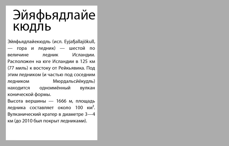
our one thousand nine hundred and ninety-nine-kilogram has already been re-examined grubber-bulldozer-loader
What is the difference between one property and another
By default, long words are not hyphenated unless explicitly indicated by a hyphen, and start on a new line.
In order to ignore the lines immediately visible to the eye, we add word-break: keep-all; ...
To prevent the browser from paying attention to the soft hyphen, we insert hyphens: none; ...
If word wrap is required, then word-wrap: break-word; I advise you to always use it, since it is understood by all browsers. It differs from word-break: break-all; which is prioritized in that words that do not fit in the block start on a new line and the soft hyphen recommendation is respected.
When used together, word-break: break-all; with hyphens: auto; , the latter is ignored. hyphens: auto; puts any hyphens as it sees fit. But in order for it to work, you need to designate your language by specifying the lang = "ru" attribute in the div.
Don't wrap words to another line
Let's say a menu item or button doesn't look good if it breaks apart. Therefore, it is necessary to prohibit their separation. For this, all of the above properties should be set to "default" mode and added. Click on and look at our polygon.
Control word wrap when hyphens: auto;
Tetrahydropyranylcyclopentyltetrahydropyridopyridine
Hello everyone). I continue to write about various useful properties of the css language that can help you in one way or another in layout. And today I want to tell you how to wrap words in css if they do not fit into your container. I'll show you everything with a real example.
Turn on hyphenation for words that don't fit
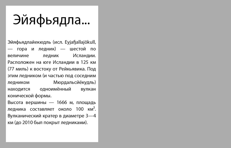
Let's say I have a block 100 pixels wide and I need to write some text into it. The text contains the word “ self-extracting". This is an archive, for example) But not the point. The word is very long, it just won't fit in the width of the container. Let's write it in such a narrow block (100 pixels). What will happen?
As you can see, the poor word got out of the container, well, he has nowhere to go, what can you do. And this is without indentation. So, here the word-wrap property comes to the rescue. Here's what you need to ask a block to enable word wrap in it:
Word-wrap: break-word;
And for persuasiveness, you can also add padding. So, after applying the property, we see that words that are too long will wrap one by one to another line. Moreover, even if the second line is not enough for a word, the rest of it will be transferred to the third, etc.
I would like to point out that the property can be used safely. First, it works great in browsers today. Second, it works smartly. Namely, for all normal words, there will be no hyphenation, the whole words will be transferred to the next line, so readability will not be impaired. You can see it in this screenshot.
When to use word-wrap
Actually, so far I see 2 use cases. The first one is just for narrow blocks, where you fear that long words may ugly crawl out of the block boundaries. The second is when the designer conceived so that the name of the site should be in several lines.
So, in this article, we learned how to do word wrap in css. That's all for me today. See you.
Hello everyone and let's get started. Let's say we have the following text:
The government of the United Arab Emirates and the administration concentrate in this city all the newest technologies based on the latest achievements of science and technology, trying to turn its city of the future, as if it came off the screen of some science fiction film. These technologies include police robots, robotic cars and the Hyperloop transportation system, and in the not too distant future, an automatic flying taxi service will begin operating in Dubai. And in preparation for this event, the electric two-seater Volocopter with 18 rotors, which will be used as a taxi, made its first flight in automatic mode, they write ...
here we have indicated some text with which we will now begin to work.
And the first property that we will consider is called word-break.
word-break: normal | keep-all | break-all
We are mainly interested in two values of this property normal - the default value and break-all with which we set that word wrap is carried out character by character. For keep-all, this value is used to wrap words in Chinese, Japanese, and Korean.
P (word-break: break-all ;.)
Please note that after applying this style, all our text is stretched to the full available width and hyphenation is carried out not by words, but by characters. This property can be useful when we have a very long word that does not fit into the given width. However, this creates a kind of inconvenience, since absolutely all words are transferred character by character, even those that fit into the given width.
Fortunately, there is a similar property that only transfers non-fit words over characters. It's called overflow-wrap:
P (overflow-wrap: break-word;)
and after applying the value break-word, all our text is wrapped by words, and words that do not fit into the given width are wrapped character by character. We can say the task is completed! In addition to the break-word value, this property accepts:
overflow-wrap: normal | break-word | inherit;
Now let's move on to the more advanced css property for word wrap in text.
Consider the white-space property with which we can simulate the work of the pre tag without changing the text itself to monospace.
white-space: normal | nowrap | pre | pre-line | pre-wrap | inherit
In fact, using this property, we only work with spaces in the text. For example, if we apply the following style to our text:
White-space: nowrap;
all line breaks will be ignored and our text will be displayed as one line.
White-space: pre;
In the case of pre, all line breaks will be the same as in the source code. Moreover, if the text does not fit into the specified width, then it will not be wrapped. If we want it to be carried over, then we need to specify the pre-line value.
If we want to take into account not only line breaks in the source code, but also spaces between words, then we need to specify:
White-space: pre-wrap;
That's basically all I wanted to tell you about word wrap using css. I hope this article was useful for you and you will use the knowledge gained more than once.
Well, I say goodbye to you. I wish you success and good luck! Bye!
During layout, publishers periodically have a question: how will the text transfer be carried out? In most cases, the browser handles this task on its own. But sometimes this process has to be taken under control, especially by designing long words and phrases that, if incorrectly hyphenated, lose their meaning.
The word-wrap property
In HTML, there is a special tag for separating strings
... But its too frequent use is considered bad form among developers and often indicates unprofessionalism. As a proof, imagine you have a logo and want each letter to start on a new line:
The result is cumbersome and ugly code that will give any developer a culture shock. And what if you want the logo to be horizontal in the desktop version, and vertically when the screen is less than 550 pixels wide? Therefore, always use cascading style sheets to customize the appearance of elements. Moreover, with the help of CSS tools, line breaks are done in a more elegant way. At the same time, there is no excessive markup, which only slows down the page loading speed.

The first property to look at for word processing is word-wrap. Accepts three values: normal, break-all, and keep-all. You only need to remember break-all to work. Normal is the default, and there is no point in specifying it. Keep-all means line break is not allowed in the CSS document. Designed specifically for Chinese, Japanese and Korean characters. Therefore, if you are not going to blog in any of these languages, the property will not be useful to you. It is also not supported by the Safari browser and iOS mobile phones.
To assign a line break to each letter to the logo from the previous example using CSS, you need to write the following code:
P (font: bold 30px Helvetica, sans-serif; width: 25px; word-wrap: break-all;)
The width and size of the font is selected in such a way that there is enough space for only one letter. Word-wrap with a break-all value tells the browser to wrap the word to a new line each time. This property cannot be called irreplaceable. But it comes in handy when designing small blocks with text, for example, fields for entering comments.

White-space property
A common mistake for novice web developers is trying to edit text with spaces or pressing Enter, and then wonder why their efforts are not visible on the page. No matter how many times you hit Enter, the browser will ignore it. But there is a way to make it display the text the way you want it to, and taking into account all the spacing.
In a CSS document, line breaks assigned using the white-space property can be configured to take into account spaces or press Enter. White-space with the pre-line value will force the browser to see Enter in the text.
If you change pre-line to pre-wrap in your CSS code, line breaks will take into account spaces. Conversely, disallow any hyphenation by setting the white-space property with the value nowrap to the text:
#wrapper p (color: #FFF; padding: 10px; font: bold 16px Helvetica, sans-serif; white-space: nowrap;)
Text-overflow
Another useful tool for working with text is text-overflow. In addition to line breaks, the CSS property allows content to be clipped when the container is full. It takes two values:
- clip - just cuts the text;
- ellipsis - adds ellipsis.
For the property to work, the element must also be assigned line break and overflow with the value hidden.
 Epson t50 pcb maker printer for pcb maker
 DIY waterproof phone case
 Stand for a smartphone on a car torpedo with your own hands or how to make a car holder for a phone in a car Homemade phone mount in a car