Basic photo editing in Photoshop. Photo Editing Basics Easy Photo Editing in Photoshop
From this issue, we begin a detailed acquaintance with the best graphic package for photo processing - Photoshop CS. Let's start with the fundamentals, the knowledge of which guarantees you success in photo editing. Unfortunately, many photographers neglect these features, which leads to a significant waste of time and effort on work that could be done much easier and faster. This issue will be some introduction to the fascinating world of Photoshop and will allow you not to fill unnecessary bumps on this long journey.
The first axiom is working with adjustment layers.
What is it, what are they for and where are they located?
The fact is that photo processing (brightness, contrast, saturation and other adjustments) can be carried out directly on the source material, which is what many amateur photographers do. But, if you do not use adjustment layers, the following problems arise:
1. In the course of work, you cannot return to previous adjustments and make any corrections to the changes you have made (and this is almost always necessary, especially if this is a large and complex work).
2. Even if you manage to return to this step (you have a lot of computer RAM, and the history palette is set to a large number of steps), then you will undo all subsequent changes you made with such difficulty.
3. You cannot change in a wide range the strength of the effect of the settings you have made for applying any filters. Applying adjustment layers saves you all of the above and makes your work a pleasure. Therefore, take for yourself the first rule - the original photo must remain intact until the very last moment!
There are two ways to access the Adjustment Layers menu. Layer / New Adjustment Layer / desired layer or, more simply, an icon Create New fill or Adjustment Layer (see photo 1). Now let's take a closer look at the main representatives of this glorious instrument.

Levels
Photo processing starts from this layer. Let's open for example in Photoshop a frame with a meadow chaser sitting on a sweet clover stalk (see photo 2).

Let's face it - the frame is very inexpressive. There may be many reasons for this, but we will not dwell on them, since we are unable to change them. We will work with the investigation. It is quite obvious that the image has a very narrow dynamic range, which can be clearly seen from the histogram of the tool. Levels(levels). Let's expand our range in order to give our image more juiciness. To do this, you can simply click on the button Auto and... get a completely "unexpected" result (see photo 3).

The photo took on an eerie purple hue. In fact, nothing unexpected happened, just first you need to enable the histogram in the panel Histogram by checking the boxes next to All Channels View and Show Channels in Color (see photo 4).

From the histograms, it can be seen that the blue color is significantly shifted relative to red and green, so when expanding the dynamic range, the program will try to equalize them, which will lead to such consequences. This does not mean that you can not use auto-correction at all. On well-balanced frames, it often gives excellent results. Therefore, it is best to apply manual adjustment in complex cases. To do this, we simply move the black and white level sliders to the beginning of the main histogram. (see photo 5).
In doing so, we lost a small amount of information in the highlights (to the right of the white level slider), but this is not a big deal, since we will return to them a little later (now, with the application of adjustment layers, this is not a problem for us). Our picture has already begun to look more beautiful, but we still have to work...

Selective Color Correction
To do this, turn on and edit the Selective Color layer. In this layer, we can selectively adjust the components of the primary colors and the color components of the neutral shades (black, gray and white). To simplify, I will post separately all the adjustments made in the layer. Selective Color (see photo 6).

The rest of the colors were left unchanged. Got the following picture (see photo 7).
Of course, the strength of the impact on a particular color depends on you and your tasks. If it may seem that the saturation of the picture is too high, then you can apply an adjustment layer Hue / Saturation (color shift / saturation).

Eliminate overexposure
Now let's get back to recovering the lost information in highlights. On the enlarged fragment, it is clearly visible that overexposure has turned out on the throat area, let's restore it in a form close to the original. To do this, select a layer with levels, turn on the drawing element Brush (brush) with the B key, the brush size is adjusted with the [ and ] keys, and the hardness (blurring) with the keys shift + . Set the opacity of the brush to 30 percent by simply pressing the 3 key on the keyboard and the painting color to black (see photo 8).
With light movements of the brush (it is very convenient to work with the pen of the Wacom graphics tablet in such cases), we will restore this fragment to the state we need. Each pass of the brush in one place will return 30 percent of the original state.

We clean memory
Our history palette and RAM are quite full, and it needs to be cleaned. Before this, it is desirable to perform an operation snapshot(state snapshot), to do this, in the history palette on the last operation, press the right mouse button and in the pop-up menu select new snapshot. After creating a snapshot of the state, you can right-click the mouse to select Clear History (clear history). And you can more radically and correctly completely clear the RAM Edit/Purge/All.
Sharpening filters
Now we need to add definition photos. Since sharpening cannot be applied to adjustment layers, and as we already said, we do not work with the main image, we need to create a copy of our original image. This can be done in different ways. For example, select in the "Layers" palette our original drawing is always the bottom layer background, then just click Ctrl+J or drag the "mouse" this layer to the icon (see photo 9).

In general, the topic of improving the clarity of an image is the topic of a separate issue, since there are many methods for solving this very important issue. For now, I will talk about the simplest photo processing techniques.
So, we have with you a copy of the main image called background copy, we will work with him. Photoshop has a special tool for sharpening - Unsharp Mask (unsharp mask). It's on the menu Filter/Sharpen/Unsharp Mask. Let's open this filter (see photo 10).

This filter has three adjustment sliders.
Amount(impact force) - set in the range from 0 to 500 percent.
Radius(radius) - set in the range from 0.1 to 250 pixels. This is the radius of your filter. As a rule, you should not set its value to more than 5 (usually 1-3). Ultimately, it all depends on the specific tasks. You can see the impact yourself.
Threshold(threshold) - a very important parameter that sets the brightness threshold of the filter (the effect will be applied to all adjacent pixels that have a brightness difference threshold greater than or equal to the set one). The smaller this number, the more elements of the image will fall into the area of influence of the filter. Typically set in the range 1-10.
You can see the effect of applying this filter in the picture. In this case, the picture looks somewhat "oversharpened". This is also not very good. Basically, the effect of "sharp" is very noticeable on the contours of the object in relation to the background. To eliminate the “oversharpening” effect, simply take the eraser (key E) and erase the outline on the image in those places where it is most striking (the lower part of the beak and the dark outline on the white neck in the previous image) (see photo 11).

In the same way, you need to carefully go through the entire image, if necessary, changing the transparency of the eraser in specific places.
Personally, I do not really like this filter for subjective reasons, and I want to talk about another method. It's called high pass(high pass filter). In my opinion, the effect of this filter is more intelligent in relation to photography and has more room for creativity.
So, Filter/Other/High Pass. Set parameter Radius in the range of 1.5–2.5. What happened to our picture? (See photo 12.)

Do not worry, everything will be OK! ...Or bad. This is dialectic! Let's change the blend mode from Normal on soft light. O miracle! I told you everything would be fine! (See photo 13.)
At the same time, the strength of the filter can be smoothly changed by the Opacity slider. If you want to further enhance its effect, then change the blending mode from Soft Light to Hard Light. Next, we act with an eraser, as described above. We will return in more detail to the use of this and other sharpening filters in another issue of the magazine.

blur filter
Another important and frequently used filter for photo processing, which I would like to talk about at the beginning of our journey, is Blur(blur). There are several varieties of this filter, but I want to focus on Gaussian Blur(Gaussian blur). Often the use of this fairly simple tool gives a very good effect when you need to smooth out background elements, for example. They can mask the "noise" in the photo, give softness and mystery to the picture, and much more. To begin with, we will simply get acquainted with his work on our bird. So, Filter/Blur/Gaussian Blur.(Did you remember to create a copy of our main image again? Well done!) (See photo 14.)

Set the blur radius to 3 pixels. In general, in this filter this parameter can be set in a very wide range, depending on the required task. As you can see, the background has become more even and beautiful, although looking at the bird, I want to wipe the glasses. So let's wipe them. We take our familiar eraser and begin to wipe. In the center of the bird, you can set a larger size and opacity of 100 percent, and as you get closer to the edges, reduce the size and set the transparency to about 30 percent. We make the hardness of the eraser (blurred borders) minimal and go ahead. It is not necessary to exactly repeat the contours of the object, it is desirable to slightly capture the background area on the border of the transition, then the picture will be more natural (that's why we make a higher transparency on the border). Then we will learn how to make a layer mask, which will make our work easier, but not all at once! And here is the result (see photo 15).

It's a good start, but imagine how it will be later! Now we need to properly crop our image to improve its composition. If we have finished our photo processing, then all layers can and should be reduced to one. Press Shift + Ctrl + E or Layer-Merge Visible (glue visible layers). Turn on Crop (cropping) with the C key on the keyboard and stretch the "elastic band" from the upper left to the lower right corner (see photo 16). If necessary, we adjust the cropped fragment in accordance with our desires and predilections and press Enter.

Change of size
The physical size of the image has been reduced. We need to increase it to the size of an A4 printed sheet (for example).
Choose Image/Image Size. The most optimal image resolution can be considered 300 dpi (dots per inch), which is perfect for printing in a minilab, and for printing on a home printer. Next, set the size of our image. For A4 format, this is, taking into account the margins, approximately 20 × 28 cm. Therefore, depending on the aspect ratio of your photo, set one of the parameters (width or height), and the second will be set automatically. In this case, the Constrain Proportions checkbox must be checked (preserving proportions), and the Resample Image conversion method must be set to the best quality Bicubic (bicubic) (see photo 17).

Sometimes, after resizing an image, it is desirable to perform a second sharpening operation, but its strength and necessity must be determined in each specific case. On this light version of photo processing can be considered complete. For most cases, this is sufficient.
Photo processing is a thing in which there are no secrets. There are so many materials in books and the Internet that you won’t read them in several lifetimes. In the era of digital photography, editing is a heavy cross for anyone who thinks he is a photographer. Photographers show only carefully processed photos - the unwritten law says.
At the same time, amateur photographers are alone with gigabytes of photos and are convulsing, trying to read articles and books on photo processing and apply it all in their practice. As a result, many novice amateur photographers lose interest in shooting and even sell the camera, switching back to the phone and Instagram. When amateur photographers ask the more experienced what and how in processing, two smashing streams fall on their heads:
- some photographers give multi-step instructions in Photoshop with masks, layers, actions, smart objects, plug-ins ... The materiel leans on the fragile brain and it boils;
- other photographers talk about the vision of light and color, the harmony of the composition, give books of an artistic bias and suggest to develop "observation", to see your colors and your picture. This philosophical approach often gives rise to a semantic gap in an immature brain, and again the brain is not ready.
I'm not trying to blow someone's brains out. I just want to share how I process my photos that you see on my blog. I have these principles:
- processing of 95% of photos should take no more than 2-3 minutes per photo;
- processing should ideally be reduced to pressing one button in the program;
- processing of 95% of photos should be universal, that is, the same;
- the output should be a photo that I like.
It is clear that photography and its processing begins with shooting. If you remove it badly, then the processing will be such flour that, well, to hell with it. Therefore, let's start with the fact that you need to take a good photo. Here I am guided by the following principles:
- personally, I only shoot in RAW, even on a phone :) I have a large memory card and a computer that can work with RAW. This allows you to not worry about white balance when shooting, it gives much softer and more pliable colors that you can drag where you want;
- I check the exposure of the captured photos on the camera display. On the Canon 5D MkII, the display shows quite honestly that there is no need to use histograms. I never used histograms at all, I don't understand them;
- I shoot 90% of the photos in the camera's automatic mode, switch to shutter priority mode when I shoot dynamic scenes so as not to blur; in the evening, when shooting from a tripod, I set all the exposure parameters manually. Shooting on the machine allows you not to bathe, but to think more about the plot and color;
- I regularly review my photos, look at photos of masters that I like. Learning to see my picture before I press the shutter release;
- I try to get out to new places, I try to visit all sorts of interesting events. This greatly expands the subject matter of my photographs;
- I think that it’s better not to shoot something if I don’t see the plot and the frame. Better to come back and shoot when the idea comes to mind.
Guided by these principles, after shooting, we have raw RAW photos with "loose" colors and a slightly lower contrast. It is these photos that shock novice amateur photographers. For the photo should be bright, saturated, contrasting, and then some, excuse me, shit. It's all about your presentation. For example, at this stage of my development, on the contrary, I do not like to take bright, saturated, contrasting photos. Thanks to Pavel Kosenko, I realized that it almost never makes sense to raise the saturation, and also to twist the contrast, to make pseudo-HDR. In short, now from the photo of Sergey Doli I spit :)
To the point. For processing 95% of my photos now I use a bunch of Lightroom + plug-ins (presets) VSCO. The essence of the VSCO package is the imitation of film transmission of light and color. And if most presets with such an imitation simply twist the usual lightroom parameters, then VSCO has an individual profile for each camera, and it is taking into account the color rendering of the camera that the processing is carried out to create a semblance of a film picture. The VSCO preset pack can be found for download by google search "vsco lightroom presets". Initially, this is a paid item.
Why imitate the film - you say - as we remember the film, it did not have such cool colors and contrast as digital. Yes, the digital picture has too good colors and contrast, they need to be spoiled, that is, corrected. For more than a hundred years, film and photo paper manufacturers have been working to ensure that the simple press of a button on a compact camera gives you a beautiful picture. It is a sin not to take advantage of such developments, because photographers and artists were also involved in the creation of films and photographic paper. I discovered for myself a truly imitation of the film after reading the book Living Digit by Pavel Kosenko. Then I set myself up a Mac virtual machine and started trying the RPP RAW converter. Together with a virtual machine, it was a chore, but I got some experience and a certain amount of observation, I got closer to understanding the picture that I want to see.
Again, I'm talking to you teeth, I will show the actual processing. After installing the presets in Lightroom's Develop mode, several VSCO folders appear in the presets area (on the left). I poked around for a long time until I found my preset type. It lies in the VSCO Film 04 folder and is called Fuji Astia 100F--. Let's see it in action.
01. RAW photo, no processing. We see that it is dull, the volume is not felt.
02. Apply Fuji Astia 100F preset-- with one click. The changes are obvious - the photo has become a little bluer, the water has become more voluminous and contrasting, and the whole picture has acquired volume. The lights have risen a little, that is, the contrast is slightly increased.
Let's see what the Fuji Astia 100F preset-- does with the Lightroom settings. The preset applies its own curve and also adjusts the highlights and shadows. Of course, you have the right to twist left or right, usually after applying the preset I make a correction in the exposure parameter, since the preset makes the photo a little lighter. And also we see in the Camera Calibration window the application of the profile of the selected film and the correction of the main tones. Blue is taken away a little in cyan, green - in the direction of yellow, red - in the direction of orange.
03. Back to the photo. I make minor adjustments to my liking. I lower the exposure, warm the picture a little. Also a slight increase in local contrast and an increase in midtones (not saturation!)
As a result, we get such a cloudy, half-evening, slightly dramatic picture, the way I wanted to see it.
Let's take a look at some more examples of my favorite Fuji Astia 100F preset--. We take a bright sunny photo without processing. Exposure is normal.
We apply the preset. There doesn't seem to be any change. But take a closer look at the texture of bread and meat - they have become more accentuated :) The photo is not very revealing, but the gopher is still there!
We click on the preset. The picture has become a little more voluminous and textured.
Now let's try to process the portrait.
And finally - a photo in the evening. It turns out something like this if you shoot in RAW
That's what the plugin gives - increases the contrast in the highlights and shadows, increases the saturation. You can drag the lights down and the shadows up, and the result is prettier than doing the opposite with the original photo.
This is how I get a processed photo in 2-3 minutes in Lightroom. Take care of your nerves, process photos quickly :)
Inspired by another brilliant idea and want to quickly bring it to life with the help of a camera? If you're just starting out on your photography journey, don't rush! First, learn the basics of this art. In the article we will tell you what problems beginner photographers most often face. You will also learn how to process photos in the PhotoMASTER editor and get rid of most of the defects.
Mistake #1. Incorrect framing
Having studied the rules for constructing a frame composition, you will know that the location of the subject strictly in the middle will make any photo boring and inanimate. To get a dynamic and interesting picture, mentally divide the future frame into 9 parts. Place everything important next to the lines or at the intersection points:
Have you already taken a photo, forgetting about the rules of composition? All is not yet lost! Our "PhotoMASTER" will quickly correct the situation. Use the crop function. Turn on the grid, and then adjust the size and position of the frame on top of the photo. Click "Apply" and all changes will be saved.

Mistake #2. The horizon is littered
You can even see this defect with the naked eye. The horizon line in the photo does not run parallel to the bottom and top of the frame, but goes up or down:

To correct the horizon, go to Composition > Geometry. Check the boxes next to Crop Automatically and Show Grid. Align the photo on the Rotate scale. If necessary, adjust the Vertical and Horizontal parameters.

Mistake #3. Lighting problems
Shooting against the sun, an unconfigured camera, a disabled flash in the dark ... All this leads to one thing - exposure problems. The photo becomes too overexposed or dark:

Photo editing will help solve the problem. In PhotoMASTER and adjust the tone of the photo. Move the slider to the right on the Exposure scale to brighten the photo, to the left to darken it. If necessary, correct the dark and light tones in the picture, as well as shadows and excessively overexposed areas.

Mistake #4. red eye
A similar defect occurs due to the use of a flash. But you can try to prevent it from appearing in the photo in advance: to do this, ask the “model” not to look directly into the lens when shooting.

You can get rid of red eyes with a corrector. You will find it in the "Retouch" section. Adjust the brush and select one of the problematic pupils. Turn down the saturation and experiment with tone. Then edit the second eye in the same way and evaluate the result in the preview window.

Mistake #5. Blurred photo
If the photographer hurries to press the shutter button while shooting, the camera will not have time to focus. When viewing a photo from a PC screen, you will notice that the photo has become blurry:

The problem can be fixed in the editor in several ways. For example, if the entire photo requires adjustments, then in the “Improvements” section, go to the “Sharpness” tab and select the optimal parameters for the image by adjusting the strength, radius, and sharpening threshold.

If you need to improve only a fragment, then use an adjustment brush (Retouch > Corrector). Highlight the area to be corrected. Then click on the "Sharpness" button and adjust the sharpness of the area.
Mistake #6. Extra objects in the frame
Captured a landscape, but a shadow got into the frame? Have portrait photos ruined pimples, flaking, and redness on your skin? Do not rush to delete pictures! Use the stamp tool. With it, you can remove all unnecessary elements, and much more. For example, in this photo we got rid of the shadow:

Adjust the brush settings and select the element in the photo that you want to mask. Then specify the location where the editor needs to copy the pixels to fill the selection. Ready!

Mistake #7. geometric distortion photo
Another problem that novice photographers often encounter. Such defects arise due to shooting objects, buildings or people from a lower or upper angle, and sometimes even simply due to lens error. This leads to the appearance of "falling buildings", distortion of figures and other unpleasant consequences.

Alas, not all geometric distortions can be corrected. But it's always worth trying! In PhotoMASTER, go to Composition > Geometry. Turn on the grid and try to align the photo using the "Distortion", "Horizontal", "Vertical" scales.

Summing up
We've broken down the most common mistakes beginner photographers make, which means you can avoid them. If unsuccessful shots still take you by surprise - it does not matter! After all, you know how to properly process photos. Install PhotoMASTER on your PC and say goodbye to bad pictures forever!
Any pictures taken even by a professional photographer require mandatory processing in a graphics editor. All people have flaws that need to be addressed. Also, during processing, you can add something missing. This tutorial is about editing photos in Photoshop.
Let's first take a look at the original photo and the result that will be achieved at the end of the tutorial. We will show the basic techniques for processing a photo of a girl and do it with maximum "pressure" so that the effects are better visible. In a real situation, such a strong correction (in most cases) is not required.
Original snapshot:

Processing result:

Steps taken:
- Elimination of small and large skin defects;
- Lightening of the skin around the eyes (elimination of circles under the eyes);
- Finishing smoothing of the skin;
- Eye work;
- Emphasizing light and dark areas (two passes);
- Minor color correction;
- Sharpening key areas - eyes, lips, eyebrows, hair.
Before you start editing a photo in Photoshop, you need to create a copy of the original layer with a keyboard shortcut CTRL+J.

So we will leave the background (original) layer untouched and will be able to look at the intermediate result of our labors. This is done simply: press ALT and click on the eye icon next to the background layer. This action will turn off all the top layers and open the source. Layers are included in the same way.
Step 1: Eliminate skin imperfections
Let's take a closer look at our model. We see a lot of moles, small wrinkles and folds around the eyes. If maximum naturalness is required, then moles and freckles can be left. We, for educational purposes, will remove everything that comes to hand. To correct defects, you can use the following tools: Healing Brush, Stamp, Patch. In the lesson we use "Healing brush".

It works like this:

The size of the brush should be chosen so that it covers the defect, but not too large. Usually 10-15 pixels is enough. If you choose a larger size, so-called "texture repetitions" are possible. Thus, we remove all defects that do not suit us.

 Practical application of MS Excel functions What is Microsoft Office Excel
 DUOLINGO - online language learning program
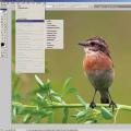 Photo Editing Basics Easy Photo Editing in Photoshop