1C end-to-end alignment. Making "managed forms" a little more manageable
Introduction
Controlled forms. New Development 1c designed to facilitate the work of the developer, give him more time to write code by simplifying the design of the interface. In fact, it often turns out that so-called. " controlled forms"Are completely uncontrollable. UV do not know how to run such banal things as folding / turning the window, not to mention its positioning on the screen and task size in pixels. Perhaps these functions were considered unclaimed and did not turn on in new interfaceBut practice shows that they are very much lacking very much. For some time the problem was partially solved due to WSH, but I wanted something more. So the external component was implemented in order to make "managed forms" slightly more manageable.
What? Where? When?
This VK is a library of functions to control the condition and position of the windows. Also in the library there are several useful system functions.
Window condition management:
Expand ( Typrookok ) — deploys a window to full screen
Collapse (titer) - folds the window in the taskbar
Hide (title) - hides the window (at the same time the code code continues to be executed)
Show () - shows the latter hidden function Hide () window
Upgraded (heading block) - in fitting the initial state window
Truth Visibility (titer-block) - P checks if the window is apparently on the screen
The truth is deployed (heading block) - checks whether the window is expanded to full screen
The truth is rolled (heading block) - checks whether the window turned into the taskbar
Install transcription(Title, coefficient) - sets the transparency of the window. The degree of transparency is set through the coefficient (0-255).
Window Management Management:
Recommeposition(Title, X., Y.) - gets the coordinates of the upper left corner of the window relative to the screen. Coordinates are returned through the parametersX, Y.
Move(Title, X., Y.) - moves the window to a specified positionXY.In this case XY.are the coordinates of the upper left corner of the window.
Operates - Gets the sizes of the window in pixels. Values \u200b\u200bare returned through the corresponding parameters.
Set sizes(Title, width, height) - Sets the size of the window in pixels.
System functions:
Different development(Horz, Vert) - Gets the current screen resolution. Values \u200b\u200bare returned through the corresponding parameters.
Receive ORDERS() - Gets a list of screen permissions available in the system. The data is returned as "resolution1, resolution2, resolution3 ...". In demo processing there is an example of forming a list of permissions on the form.
Set up(Selected defrost to screen) - Sets the screen resolution. The parameter specifies the sequence number of the permission. The demo processing shows an example of setting permission from a previously formed list.
Bonuses:
Sleep (stays) sleep ().The time is indicated in milliseconds.
Signal (frequency, duration) - implementation of classical functionbeep ().Allows you to set the frequency and duration of the sound.
TOTAL
The library has written for his own needs and may be refined as needed. If someone has a bright idea to expand its functionality within the framework of the subject area for which it thought, then write wishes. If ideas are worthwhile, they will be implemented.
The package includes: base with connected VC in the form of a shared layout and demonstration processing. VC in zip archive.
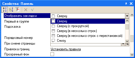
On ordinary forms, the location of the elements is performed completely manually. To facilitate this process, the platform offers several mechanisms:
- alignment elements - Provides automatic centering, or "pressing" controls to the controls to the guideslines of each other, or align the dimensions of the controls:
- grid- You can configure the mesh display through the parameters, for accurate manual alignment of the items:
The correct answer is the second. This is the alignment panel and unification of the size of the elements.
Question 10.79 Exam 1C: Professional on the platform.
- Nothing will change
- There will be a shift horizontally element "Inspection1" and aligning its right border on the right border of the element "Inscription2"
- There will be an offset horizontally element "inscription2" and aligning its right border on the right border of the element "Inscription1"
- Both elements will move to the right edge leveling line
The correct answer is the second. The inscriptions are leveled by right.
Question 10.82 Exam 1C: Professional on the platform. What happens if you press the command panel button marked in the picture?
- All inscriptions will be horizontally the same size.
- Nothing will change
- There will be a displacement of the inscriptions. The vertical axis of the symmetry of each control will coincide with the vertical axis of the shape symmetry, i.e. Centering each control horizontal control
- There will be a shift in horizontal inscriptions. Moving control elements relative to each other inside the group will not happen, i.e. centering as if one element as a whole
- There will be a shift of the inscriptions vertically. Moving control elements relative to each other inside the group will not happen, i.e. centering as if one element as a whole
The correct answer is the fourth. All selected controls are centered with respect to their common central line.
Question 10.83 Exam 1C: Professional on the platform. What happens if you press the command panel button marked in the picture?
- All inscriptions will be vertically the same size. Over the sample will be taken an element "Inscription1"
- Nothing will change
- All inscriptions will be vertically the same size. For the sample will be taken an element "Inscription3"
- There will be a centering of each inscription vertically
- There will be a uniform distribution of inscriptions in the vertical direction. The control elements "Inscription1" and "Inscription3" will remain in its place, and the element "Inscription2" will be shifted in the desired side. When the element is displaced, the binding to the markup grid is not taken into account
- There will be a uniform distribution of inscriptions in the vertical direction. The control elements "Inscription1" and "Inscription3" will remain in its place, and the element "Inscription2" will be shifted in the desired side. When an element is displaced, a binding to a milling grid will be performed if its use mode is set.
The correct answer is the first. The height of the elements will be standardized
Question 10.86 Exam 1C: Professional on the platform. What happens if you press the command panel button canceled in the picture?
- All inscriptions will be vertically and horizontally the same size. Over the sample will be taken an element "Inscription1"
- All inscriptions will be vertically and horizontally the same size. For the sample will be taken an element "Inscription3"
- Nothing will change
- Automatic alignment of inscriptions will be performed
- For all the inscriptions will be given a transparent background.
The correct answer is the fourth, the actual button is called "Align automatically"
Question 10.90 exam 1C: Professional on the platform. Disable alignment mode with leveling lines in the previously created form:
- It is impossible
- Can. To do this, in the form properties palette, you need to disable the "Use leveling lines" property.
- Can. To do this, by selecting the "Service-Parameters" menu item, on the "Form" tab, you need to disable the "Use Aligning Line" property.
- Can. To do this, in the Form Properties palette, you need to disable the "Use Aligning Line" property or by selecting the "Service-Parameters" menu item, on the "Form" tab to disable the "Use Aligning Lines"
The correct answer is the second. Aligning lines (marked by arrow) are disconnected by the corresponding property of the form:
Question 10.92 Exam 1C: Professional on the platform. When aligning the form elements, the markup mesh can be shown:
- Continuous lines
- Points located in a checker order
- Points located in the crossing places of marking lines
- Right answers 1 and 2
- Right answers 2 and 3
- Right answers 1, 2 and 3
The correct answer is the fifth. The location of the points is regulated by the option of the chess order of the system parameters (see Screenshot in Post).
Question 10.95 Exam 1C: Professional on the platform.
- Special alignment marker showing offset controls. Dedicated control is proposed to move to the left
- Special alignment marker showing offset controls. Dedicated control is proposed to move down
- Special alignment marker showing the overlay controls. Dedicated control is proposed to move to the left
- Special alignment marker showing the overlay controls. Dedicated control is proposed to move down
The correct answer is the first. The lower field is shifted to the right relative to the top, respectively, it is proposed to move the left.
Question 10.96 Exam 1C: Professional on the platform. Is it possible to change the dimensions and move the form controls using the leveling lines?
- It is impossible
- You can, if the controls are attached to these lines
- You can, if the controls are attached to these lines, but only move
- You can, if the controls are attached to these lines, but only change the dimensions
- You can always
The correct answer is the second. Elements attached to one geline can be moved together.
Question 10.97 Exam 1C: Professional on the platform. In the picture, the red circle is marked:
- Special alignment marker showing offset controls. Dedicated control is proposed to move left and up
- Special alignment marker showing offset controls. Dedicated control is proposed to move to the right and down
- Special alignment marker showing the overlay controls. Dedicated control is proposed to move left and up
- Special alignment marker showing the overlay controls. Dedicated control is proposed to move to the right and down
The correct answer is the fourth. Where shift arrows, you need to move there.
Question 10.98 Exam 1C: Professional on the platform. In the picture, the red circle is marked:
Question 10.110 Exam 1C: Professional on the platform. How using the command panel button shown in the figure, align all three inscriptions on the right border?
- First, select the "Inscription" control element, clicking on it with the left mouse button, simultaneously pressing the key. Then press the specified button
- Just click on the specified button
- Using the specified button, it is impossible to align the inscriptions, as they belong to different panels
Question 10.115 Exam 1C: Professional on the platform. To display in the existing form of the markup grid enough:
- In the form properties palette, set the property "uses a lot"
- After selecting the "Service-Parameters" Main menu item, on the "Form" tab, set the "Use Table" flag
- Selecting the "Service-Parameters" menu item, on the "Form" tab, set the "Display Mesh" flag
- After selecting the "Service-Parameters" menu item, on the "Form" tab, set the "Display Mesh" flag, after which in the form properties panel setup
- Selecting the main menu item "Service-Parameters", on the "Form" tab to set the flags "display the grid" and "use a lot"
The correct answer is the fourth, for the form you can also specify the option to display or not.
Implemented in version 8.3.7.1759.
In order to be clear what we are talking about this article, you need to make a small explanation.
The feature of the driven forms is that the developer does not forms appearance Forms directly. The developer only creates a form description with some logical rules. Based on these rules, the platform independently generates a visual representation of the form. Moreover, this visual representation depends on the size of the window in which the form is displayed. The same form shown in a narrow window or in the window disclosed on the entire screen will have a different visual representation.
So, that part of the platform, which forms a visual representation of the form, is called mechanism for placing elements in the form.
Why did you need a new mechanism?
First, the former mechanism, unfortunately, had shortcomings. The most significant of them were that many changes in the properties of the form elements performed on the client demanded a mandatory appeal to the server. And any appeal to the server leads to a slowdown in work.
Secondly, we evaluated the experience of using managed forms and found a number of critical needs that needed to be implemented.
And, thirdly, we wanted to lay the possibility of future development into a new mechanism.
Main changes
Schematically submit the work of the previous mechanism as follows:
The developer in the configurator creates the form elements tree and sets the properties of the elements. At that moment, when the application solution should show the form of the user, the following occurs. First on the server creates the platform description of visual form. Then this description is transmitted to the client. And on the client visualizer Forms the image that the user will see.
The main action that was performed on the server when creating a description of the visual form is the calculation of string lengths. Meaning all sorts of headlines, inscriptions and so on. Knowing string lengths can already calculate the location of the elements in the form.
Since this operation was performed on the server, there were two negative points. First, not the fonts that will be used on the client are used to calculate, but those that are installed on the server. And they may differ, especially if we are talking about different platforms (Windows, Linux). Or even the desired fonts can not be installed at all on the server. Secondly, one "engine" of rasterization of fonts, which is on the server, was used to calculate the lengths. And it can not work as much as the mechanism for rendering text strings existing on the client in the Internet browser, for example. As a result, form could appear either with "cropped" texts, or, on the contrary, with too wide inscriptions.
Another problem was that there was no adaptation to the size of the window in which the form will be shown by the client. In fact, on the server, the description of the form was created based on the minimum possible window size, and the further success of its display depended on how well it can be stretched.
In the new mechanism, the generation of the description of the visual form, which was previously fully implemented on the server, we divided into two parts, server and client:

The server part has become significantly less. No calculations are performed in it. On the server, only the "blank" of the description, which does not contain accurate lengths of text fields, are created, and elements of adaptability are not allowed. The visibility of the elements is processed on the server, but only the one that is determined by the functional options, and the one that is installed by the user. But here and it is impossible otherwise, because the functional options themselves are available only on the server. And the interactive change in the user settings in any case will lead to the server call.
As a result, a certain "semi-finished product" of the visual presentation of the form is transmitted to the client.
The client makes the necessary refinement of the description of the visual form. String lengths are calculated, the elements of adaptability associated with the size of the client display are calculated, and visibility is being implemented. After that, as before, a visualizer begins to work, which creates the final form, which the client sees.
Due to the fact that the calculation of the lengths of the strings is made on the client, it was possible to get rid of unnecessary and non-accurant "slots" between the elements. And the development of visibility on the client without circulation to the server allowed to speed up the work of the forms. Because the enable / disable form of the form elements is one of the most frequent operations.
Some new features
Elements of adaptive interface
The new mechanism for placing elements in the form not only improves the opportunities that had earlier, but also adds new features. For example, it adapts the appearance of the form to the size of the client display. For this, several paths are used.
First, automatic transfer of rows with an adjoint height of headlines and scenery is performed. How it works, you can see in the picture:

If in the form there are long lines that can be divided into separate words, then such lines are transferred if there is a need. Accordingly, the height of the form increases, because its lower part "departs" down. As a result, the form will look normally even on narrow screens. Moreover, this mechanism works dynamically, and therefore you can compress the form in real time, and along with it long lines will be transferred.
Automatic transfer works for headers of elements, group headers, text scenery and text in buttons related Hyperlink.
The second element of adaptability is to change the orientation of groups. The groups and the form as a whole appeared new option Orientation - " Horizontally, if possible" In this embodiment, if the client display allows you to position the elements horizontally, they are located horizontally. If not, they are located vertically.
The third element of adaptability is automatic definition The number of columns at the switch or toggle. Previously, if there were no special instructions, the number of columns was set to the maximum, and it was displayed in one line. Now, in the same situation, the width of the form is analyzed, and the number of columns is set at which the switch / toggle switch will look good on the screen.
Horizontal and vertical alignment
Previously, such an opportunity was absent, and to implement non-standard alignments I had to invent different "tricks". Now form and group can be indicated how its elements vertically should be aligned and horizontally. For example, in the figure below, a group of buttons shows three possible alignment options: Leo, Centre and Right:

In this pattern, the buttons are placed in a conventional group, which is stretched horizontally. The location of the buttons inside the group is controlled by the group property Horizontal attitudes.
Control of external alignment
For example, you have a form in which the field is located Subdivision, groups Address and Telephone. The former mechanism align the fields of these groups as shown on the left figure. The fields in the form were aligned between themselves, and the fields in each group were aligned with each other.

Now you have the opportunity to install through alignment groups, with the result that, for example, all field fields will be equally aligned. This variant is shown on the right figure.
Moreover, you can control end-to-end alignment for each group separately. Therefore, you can, for example, turn off through alignment for the group TelephoneAnd then the form will look like shown on the right drawing.

Alignment elements and headlines
Another new feature that appeared is the ability to control the mutual arrangement of the elements and headlines. Both in all form and in individual groups. For example, headlines and items you can "stretch" to different edges of the form, or vice versa, "pull" them to each other, aligning the headers to the right, and elements - to the left.

Restriction of the maximum width of the elements
Previously, if you specified items that it should stretch, the element stretched until it is possible. For example, full screen. For some elements, it was good (for example, the HTML field), and for other elements it could be not very good. For example, for numeric fields. Because the numeric data, or the field control buttons, turned out somewhere far from the right.
Now the elements have boolean properties, with which you can set the automatic stretching mode in width or height. In this mode, the platform independently determines to what borders can stretch the field. If the automatic mode is turned off, then the platform will behave in the same way as before. If you specify a specific width / height of the field, it will be used. And if you specify a value of 0, the element will stretch until it is possible.
Distance control between elements
Also appeared the ability to control horizontal and vertical intervals between the elements. For example, in the following figure in the left group, the vertical interval is increased, and the right - reduced.

Disabling stretching form
We have implemented another, new form work mode, which turns off stretching its vertical elements. This mode will be useful for forms containing not a large number of Elements.
Disable scrolling in pages
For forms containing a large number of elements, we also changed a few behavior. Now the vertical scrolling in the pages does not appear. Vertical scrolling Now it can be at the very form or inside the elements of the form, such as the table, tabular document etc. And the form page will always have a full height. It should facilitate user work, because a large number of scrollers in the form often confuse and confuses.
Summary
In this review article, we listed only the main features that give a new mechanism for placing elements in the form. But no less important in our opinion and the fact that in this mechanism there is a substantial stock for future development.
Form editor is used to create and edit forms of applied solutions. Forms of objects are used by the system for visual display of the object data during the user's operation.
Any form represents a combination of three components:
- form dialog - windows that will be displayed on the screen;
- module forms - programs in the embedded language that is responsible for working with elements of the form controls and event processing;
- the details of the form are a set of objects belonging to the data of which it uses in its work.
Directly the form editor provides editing the form dialog, its details and causes the text editor and modules to edit the module of the form.

The form editor window contains three bookmarks that edit all three components of the form.
Editing dialogue form
Form editor allows the developer to fully use a wide range of dialog capabilities. We list the main of these features:
Panels, Pages, Bookmarks
The editor of the dialogue allows the developer to place special controls in the form, which help to make a form of their own recognizable style, make access to the data simple and understandable, and place a large amount of information on a limited area.
The editor allows you to place several panels on the form, each of which may contain several pages. For example, the document form may contain a panel with two pages: goods and additionally:
The developer has the ability to set the mode in which pages will scroll within the panel, or use bookmarks to switch between pages. The editor allows you to define a large number of variety of locations and display bookmarks:
For example, bookmarks can be arranged from above horizontally:
Or you can lay bookmarks on the left vertically:
Control elements
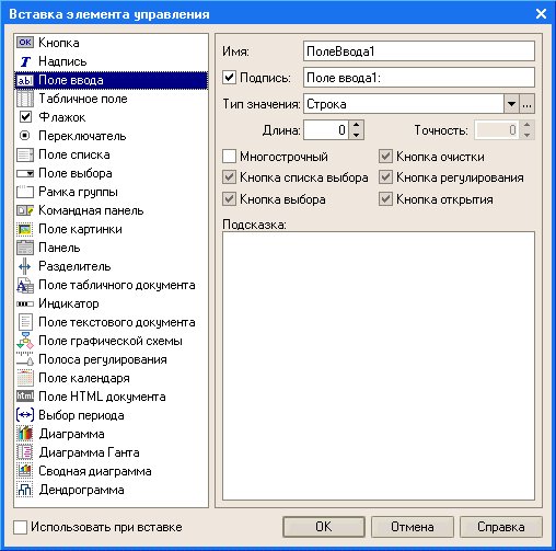
The editor allows you to place a large number of diverse controls in the form. You can place controls by dragging, or using a special control dialog inserting controls, which allows you to simultaneously set the desired properties of the selected control item:
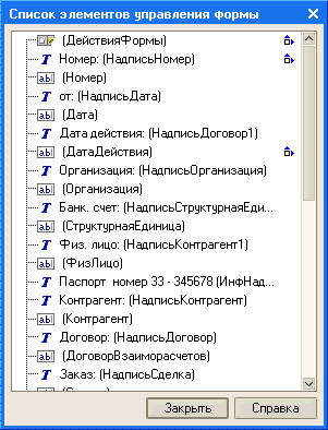
In the case when the form contains a large number of controls, the developer can use the control mode of controls in the list, which allows you to quickly move to the desired control:
The editor provides the ability to specify the order in which the user will circulate the elements of the form controls when entering and editing data. It is possible to install automatic bypass order or manual task of the account of the account in the Special Control List, or click right on the form:
Grid, alignment
Editoriform has great opportunities to manage the placement of elements on the form. In particular, it supports work with a markup mesh, when the boundaries and dimensions of the controls are aligned with a milling grid located in the form. The developer has the ability to change the pumping grid step and thereby seek a more accurate location of controls:
Also, the editor supports the use of leveling lines that serve to facilitate the alignment and mutual location of the form controls. For example, in the following figure, the leveling lines are used to place controls on the page additionally:
The developer has the ability to position the required number of horizontal or vertical leveling lines on the page, as well as use invisible leveling lines. Invisible leveling lines editor creates automatically after two or more controls are aligned with any of the boundaries. For example, if two fields of the same size were aligned on the left border, the invisible leveling line will be created along the right aligned boundaries of these fields.
Aligning controls can also be performed using special markers showing the desired direction of control of controls. Markers appear when two controls are in close proximity to each other.
Blue aligning markers indicate the desired direction of movement of the control element for aligning it to one of the boundaries of the adjacent control:
Red leveling markers indicate the desired direction of moving the control in the case when it overlaps another control:
It should also be said that the editor supports alignment operations, sizes and order groups for a group of controls:
Binding
The form editor allows you to configure the behavior of the controls located in the form, so that with the change in the size of the form, the natural perception of information was provided: one part of the elements remained on the spot, the other part moved along with the boundaries of the form, and the third part changed its size in accordance with By changing the size of the form.
To specify such behavior of the form elements, the developer can describe the bindings - the dependence of the position of the boundaries of controls from the position of the boundaries of the form. The border of the control can be tied both to the border or the center of the form and the border or the center of another control.
The editor supports a wide variety of various types of bindings and can display them in graphical form:
Dividers
Separators are special elements of controls, with which it is possible to redistribute the form space without changing its size. In 1C mode: The enterprise separator has the ability to "capture" with the mouse and move inside the form within its limits, taking into account the possibility of location of other elements of control and orientation of the separator:
When the separator is moved, all controls that are tied to the separator will change their dimensions or move in accordance with the established bindings:
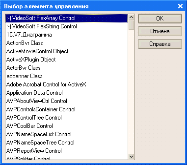
ActiveX.
The editor allows you to place the ActiveX type control elements in the form, which the developer can configure and continue to manage them using the built-in language tools:


Editing module form
To edit modulaforms, the configurator calls the text editor and modules. This editor provides the developer a wide variety of opportunities to create and modify the text of the module.
Editing form details
Editing the details of the form is performed in the list, which allows you to create new details, change existing and remove unnecessary details:
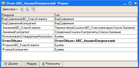
If the form exists the main props, which determines the behavior of the form, different from the typical, is highlighted in bold. The developer can set the cursor to the desired props and, using the menu command, immediately go to the shape dialog, to that element of the control that corresponds to the selected props.
Additional Information
You can get acquainted with the form editor in real time. To do this, you can download a demonstration clip "An example of developing a trading mini-system", which shows the process of developing a trading mini-system using this editor to create forms of documents "Parish invoice", "Consumables" and forms of reports "Sales analysis" and " Analysis of sales by periods. "
19.05.2015Implemented in version 8.3.7.1759.
In order to be clear what we are talking about this article, you need to make a small explanation.
The peculiarity of managed forms is that the developer does not form an appearance of the form directly. The developer only creates a form description with some logical rules. Based on these rules, the platform independently generates a visual representation of the form. Moreover, this visual representation depends on the size of the window in which the form is displayed. The same form shown in a narrow window or in the window disclosed on the entire screen will have a different visual representation.
So, that part of the platform that forms a visual representation of the form is called the mechanism for placing elements in the form.
Why did you need a new mechanism?
First, the former mechanism, unfortunately, had shortcomings. The most significant of them were that many changes in the properties of the form elements performed on the client demanded a mandatory appeal to the server. And any appeal to the server leads to a slowdown in work.
Secondly, we evaluated the experience of using managed forms and found a number of critical needs that needed to be implemented.
And, thirdly, we wanted to lay the possibility of future development into a new mechanism.
Main changes
Schematically submit the work of the previous mechanism as follows:
The developer in the configurator creates the form elements tree and sets the properties of the elements. At that moment, when the application solution should show the form of the user, the following occurs. First on the server, the platform creates a description of the visual form. Then this description is transmitted to the client. And on the client, the visualizer forms the image that the user will see.
The main action that was performed on the server when creating a description of the visual form is the calculation of string lengths. Meaning all sorts of headlines, inscriptions and so on. Knowing string lengths can already calculate the location of the elements in the form.
Since this operation was performed on the server, there were two negative points. First, not the fonts that will be used on the client are used to calculate, but those that are installed on the server. And they may differ, especially if we are talking about different platforms (Windows, Linux). Or even the desired fonts can not be installed at all on the server. Secondly, one "engine" of rasterization of fonts, which is on the server, was used to calculate the lengths. And it can not work as much as the mechanism for rendering text strings existing on the client in the Internet browser, for example. As a result, form could appear either with "cropped" texts, or, on the contrary, with too wide inscriptions.
Another problem was that there was no adaptation to the size of the window in which the form will be shown by the client. In fact, on the server, the description of the form was created based on the minimum possible window size, and the further success of its display depended on how well it can be stretched.
In the new mechanism, the generation of the description of the visual form, which was previously fully implemented on the server, we divided into two parts, server and client:
The server part has become significantly less. No calculations are performed in it. On the server, only the "blank" of the description, which does not contain accurate lengths of text fields, are created, and elements of adaptability are not allowed. The visibility of the elements is processed on the server, but only the one that is determined by the functional options, and the one that is installed by the user. But here and it is impossible otherwise, because the functional options themselves are available only on the server. And the interactive change in the user settings in any case will lead to the server call.
As a result, a certain "semi-finished product" of the visual presentation of the form is transmitted to the client.
The client makes the necessary refinement of the description of the visual form. String lengths are calculated, the elements of adaptability associated with the size of the client display are calculated, and visibility is being implemented. After that, as before, a visualizer begins to work, which creates the final form, which the client sees.
Due to the fact that the calculation of the lengths of the strings is made on the client, it was possible to get rid of unnecessary and non-accurant "slots" between the elements. And the development of visibility on the client without circulation to the server allowed to speed up the work of the forms. Because the enable / disable form of the form elements is one of the most frequent operations.
Some new features
Elements of adaptive interface
The new mechanism for placing elements in the form not only improves the opportunities that had earlier, but also adds new features. For example, it adapts the appearance of the form to the size of the client display. For this, several paths are used.
First, automatic transfer of rows with an adjoint height of headlines and scenery is performed. How it works, you can see in the picture:

If in the form there are long lines that can be divided into separate words, then such lines are transferred if there is a need. Accordingly, the height of the form increases, because its lower part "departs" down. As a result, the form will look normally even on narrow screens. Moreover, this mechanism works dynamically, and therefore you can compress the form in real time, and along with it long lines will be transferred.
Automatic transfer works for headers of elements, headers of groups, text scenery and text in buttons related to the hyperlink.
The second element of adaptability is to change the orientation of groups. The groups and the form as a whole appeared a new orientation option - "horizontally, if possible." In this embodiment, if the client display allows you to position the elements horizontally, they are located horizontally. If not, they are located vertically.
The third adaptability element is an automatic determination of the number of columns at the switch or toggle. Previously, if there were no special instructions, the number of columns was set to the maximum, and it was displayed in one line. Now, in the same situation, the width of the form is analyzed, and the number of columns is set at which the switch / toggle switch will look good on the screen.
Horizontal and vertical alignment
Previously, such an opportunity was absent, and to implement non-standard alignments I had to invent different "tricks". Now form and group can be indicated how its elements vertically should be aligned and horizontally. For example, in the figure below, a group of buttons shows three possible alignment options: left, center and right:

In this pattern, the buttons are placed in a conventional group, which is stretched horizontally. The location of the buttons inside the group is controlled by the group property horizontal attributive.
Control of external alignment
For example, you have a form in which the field is located, group address and telephone. The former mechanism align the fields of these groups as shown on the left figure. The fields in the form were aligned between themselves, and the fields in each group were aligned with each other.
Now you have the opportunity to install through alignment groups, with the result that, for example, all field fields will be equally aligned. This variant is shown on the right figure.
Moreover, you can control end-to-end alignment for each group separately. Therefore, you can, for example, disconnect through alignment for the phone group, and then the form will look like shown on the right drawing.

Alignment elements and headlines
Another new feature that appeared is the ability to control the mutual arrangement of the elements and headlines. Both in all form and in individual groups. For example, headlines and items you can "stretch" to different edges of the form, or vice versa, "pull" them to each other, aligning the headers to the right, and elements - to the left.

Restriction of the maximum width of the elements
Previously, if you specified items that it should stretch, the element stretched until it is possible. For example, full screen. For some elements, it was good (for example, the HTML field), and for other elements it could be not very good. For example, for numeric fields. Because the numeric data, or the field control buttons, turned out somewhere far from the right.
Now the elements have boolean properties, with which you can set the automatic stretching mode in width or height. In this mode, the platform independently determines to what borders can stretch the field. If the automatic mode is turned off, then the platform will behave in the same way as before. If you specify a specific width / height of the field, it will be used. And if you specify a value of 0, the element will stretch until it is possible.
Distance control between elements
Also appeared the ability to control horizontal and vertical intervals between the elements. For example, in the following figure in the left group, the vertical interval is increased, and the right - reduced.

Disabling stretching form
We have implemented another, new form work mode, which turns off stretching its vertical elements. This mode will be useful for forms containing a small number of items.
Disable scrolling in pages
For forms containing a large number of elements, we also changed a few behavior. Now the vertical scrolling in the pages does not appear. Vertical scrolling can now be at the very form or inside the form elements, such as a table, a tabular document, and so on. And the form page will always have a full height. It should facilitate user work, because a large number of scrollers in the form often confuse and confuses.
Summary
In this review article, we listed only the main features that give a new mechanism for placing elements in the form. But no less important in our opinion and the fact that in this mechanism there is a substantial stock for future development.
 Doesn't Diablo III start?
 How to check the computer to spyware
 Spyware on the computer