Graph by points in mathcad. How to build a graph in Mathcad? Algorithm for constructing a graph
To build graphs in Mathcad, you can use the function Insert > Graph > Graph Type or toolbar Schedule(Fig. 1. 18). The following chart types are supported:
When you select the mode for constructing a two-dimensional graph in the X-Y coordinate axes, a template is created on the worksheet (Fig. 1. 19) with placeholder fields for specifying the displayed data along the abscissa and ordinate axes (names of arguments and functions or expressions for them, as well as ranges changing values). The placeholder at the middle of the coordinate axis is for the variable or expression displayed along that axis.

Fig.1. 19 Blank 2D chart template.
Placeholders for boundary values appear after entering an argument and/or function. The axis limits are selected automatically based on the range of the values, but they can be set by clicking in the corresponding placeholder fields and changing the values in them.
In Fig.1. Figure 20 shows a template filled with parameters, with the ranges of values along the axes defined manually. Note that these values are visible only in the chart editing mode (the presence of a corner cursor in the figures indicates that the block with the chart is currently selected).

Fig.1. 20 Two-dimensional graph.
The variable is plotted along the abscissa axis, setting boundary values for it (as in Fig. 1. 20). In placeholders at The y-axes usually place functions, expressions, or vectors.
You can create multiple graphs in one graphics area. To do this, you need to list several expressions for the corresponding axis separated by commas (Fig. 1. 21).

Fig.1. 21. Construction of two graphs in one coordinate system.
Different curves are depicted in different colors, and to set the format of the graph elements, you need to double-click on the graph area. To control the display of constructed lines, use the tab Footprints(Traces) in the dialog box that opens (Fig. 1. 22). The current format of each line is shown in a list, and below the list are controls that allow you to change the format. Field Legend Mark(Legend Label) specifies a description of the line, which is displayed only when the Hide Legend checkbox is cleared. List Symbol(Symbol) allows you to select markers for individual points, list Line(Line) specifies the line type, list Color(Color) - color. List Type(Ture) defines the way individual points are connected, and the list Size(Width) - line thickness.

Fig.1. 22. Setting the types of graph lines.
A graph in polar coordinates is constructed and formatted in a similar way, and for graphs of other types, matrices of point coordinate values must first be created.
The more accurate the initial approximation of the root is chosen, the faster it will be root converge.
To change the precision with which a function root is looking for the root, you need to change the value of the TOL system variable. If the TOL value increases, the function root will converge faster, but the answer will be less accurate. If the TOL value decreases, then the function root will converge more slowly, but the answer will be more accurate. To change the TOL value at a specific point in a work document, use a definition of the form TOL=0.01. To change the TOL value for the entire working document, select the command Tools Worksheet Options... Built-in Variables Tolerance of convergence (TOL).

Fig.1. 23. Setting the accuracy of calculations.
If two roots are close to each other, the TOL should be reduced to distinguish them.
If the function f(x) has a small slope around the desired root, the function root(f(x), x) Maybe converge to value r, located far enough from the root. In such cases, to find a more accurate root value, it is necessary to reduce the TOL value.
For expression f(x) with a known root A finding additional roots f(x) is equivalent to finding the roots of the equation h(x) = f(x)/(x-a). This technique is useful for finding roots that are close to each other. It's easier to find the root of the expression h(x) than trying to look for another root of the equation f(x) = 0, choosing different initial approximations.
In this tutorial, we'll look at the charting options available in PTC Mathcad Prime 3.0.
Types of charts
To change the graph type, click on it, then select on the Graphs tab -> Curves -> Change type. Below are pictures of four types of graphs for a function:


There are some other axis types in the list - we'll use some of them later.
Several graphs on the same axes
To add a curve to an axis, place the cursor after the graph's Y-axis legend and click Graphs -> Curves -> Add Curve. Another placeholder for the Y axis will appear:

You can add more graphs using the same command.
By displaying several graphs on the same axes, we will look at various settings from the Graphs -> Styles menu. For this purpose, we will create axes with five different straight lines. Each line contains 11 points:
Below these expressions, insert an XY plot, then add four legends for the Y axis. In the X-axis placeholder, enter x—all five plots will use the same X-axis legend. In the final Y-axis placeholder, enter y:
Above you should enter y:


Parametric graph
This circle plot is plotted using the parameter t:

Logarithmic graphs
The logarithmic scale is often used in various fields of science and technology. Plotting plots on a logarithmic scale is available in Mathcad.
Let's plot the function y=x 2, but using the parameter:

To make the X-axis logarithmic, select the X-axis legend and click Graphs -> Axes -> Logarithmic Scale. Do the same for the Y axis. On a logarithmic scale, this function is a straight line:

Summary
In this lesson we showed how you can modify two-dimensional graphs.
- To change a curve type, click on its Y-axis legend and select Graphs –> Curves –> Change Type.
- To add a curve:
- place the cursor on the Y-axis legend;
- Click Graphs –> Curves –> Add Curve.
- To change the symbols, color, style, or thickness of a curve, click on the Y-axis legend of the corresponding graph and customize the graph using the Graphs -> Style menu.
- To scale a graph, divide the appropriate axis legend by the scaling factor.
How to graph a function in MathCAD
In order to build a simple graph of a function in the Matkad system, you need to perform the following sequence of actions:
- First of all, you need to open the program and enter the function expression into the active window using the appropriate tools.
- After entering the expression, go to the panel with mathematical symbols and select display of graphs. A corresponding window should appear in the program in which you can select the function graph model of interest.
- Since a two-dimensional graph is required to visually display a simple function, you need to find it in the graph panel and select it. After this action, a sample of the selected chart should be displayed in the program window.
- You must enter function variables in the template. In the field for entering the template along the “X” axis, you need to write down the value of the independent variable of the function, and in the corresponding field for the “Y” axis, the value of the dependent variable of the function that needs to be plotted.
- To finish constructing a graph of a function, you just need to click the mouse outside the graph template, and it will be fixed in the program window. From this point on, the graph of the function is constructed. It can be rotated or resized using the appropriate tools.
- It is also necessary to take into account that the program automatically sets the coordinate values along the “X” axis in the range from -10 to +10. In accordance with this scale, the coordinate values of each point along the “Y” axis are automatically calculated. However, this scale is set by default, and if there is a need to change it, this can be done by independently specifying the range of changes in coordinates along the “X” axis.
How to build a graph using points
Constructing a graph in Matkad using given points has some features. In this case, there is no access to the function expression, but there is a given number of points that can be represented in the program in different ways. The simplest method for constructing such a graph is the following algorithm:
- First you need to open the Matkad program and go to the Insert tab. After this, in the menu you need to select “Data”, and then “Table”.
- As a result, a table of two columns should appear in the program, into which you must enter the corresponding variable values. It happens that in specific tasks they do not give paired values, but ask to calculate the value of a function using one variable. In this case, you need to make preliminary calculations, and after that, start entering data into the created table.
- When all the data is entered into the table, create a simple two-dimensional graph, indicating in the appropriate fields for each coordinate axis the value that is in the first row of each column of the table (column header). As a result, the created table should be completely reflected in the graphics.
Another similar way of constructing graphs in Matkad using given points is a matrix. In this case, the values are specified in two columns with the same number of characters. You must also go to the “Insert” tab in the program, but select the “Matrix” item. As a result, two columns should appear in which we enter paired coordinate values for each known point on the graph.
To display the formatting window for a two-dimensional graph, simply place the mouse pointer in the graph area and double-click the left mouse button. A formatting window will appear in the document window. It has a number of tabs. A tab becomes active by placing the mouse pointer over its name and left-clicking.
As you can see in the figure, the formatting window has four tabs:
- X-Y axes - setting parameters for formatting axes;
- graph lines – setting parameters for formatting graph lines;
- labels—set parameters for formatting axis labels;
- default—sets the specified formatting options as the default options.
1. Formatting the graph axes.
The X-Y axis tab contains the following main parameters related to the X and Y axes (Axis X and Axis Y):
- Logarithmic scale – setting a logarithmic scale;
- Grid lines – setting scale grid lines;
- Number – setting of digital data on axes;
- Autoscale – automatic chart scaling;
- Apply marks – setting divisions along the axes;
- Autogrid – automatic installation of scale lines;
- Number of intervals – setting a specified number of scale lines.
The Axis Style group allows you to set the display style of coordinate axes:
- Frame – axes in the form of a rectangle;
- Visor – axes in the form of a cross;
- Nothing - no axes;
- Equal divisions – setting the same scale along the graph axes.
2. Formatting graph lines.
This tab is used to control the display of lines from which the graph is constructed. This tab provides the following options:
- Legend label – select the line type in the legend;
- Symbol – select a symbol that is placed on the line to mark the base points of the graph;
- Line – setting the line type;
- Color – set the color of the line and base points;
- Type – setting the chart type;
- Thickness – set the line thickness.
Nodal points (points for which coordinates are calculated) of graphs often need to be highlighted with some kind of figure. The Symbol column list allows you to select the following marks for the base points of the graph of each function:
- nothing - no mark;
- x’s – slanted cross;
- +’x – straight cross;
- square – square;
- rhombus - rhombus;
- o's – circle.
The list in the Line column allows you to select line types: continuous, dotted, dash-dotted.
The Type column drop-down list allows you to select the following types of graph lines:
- line – construction with lines;
- dots – construction with dots;
- intervals – construction by vertical lines with an assessment of the error interval;
- column – construction of a histogram in the form of columns;
- step - construction with a stepped line;
- broaching – construction by broaching from point to point.
3. Setting labels on graphs.
This tab allows you to enter additional labels into the chart. To set labels use the following input fields:
- Title – setting the title inscription for the picture;
- X axis – setting the label along the X axis;
- Y axis – setting the label along the Y axis.
In the Title group there are switches at the top and bottom for setting the title text either above or below the graph.
4. Default chart options.
The Defaults tab allows you to set formatting options set on other tabs as default options. To do this, use the "use as default" checkbox. By clicking on the "restore default values" button, you can return the standard chart parameters.
Plot a graph of the function p(x)=5*x^6-3, setting your color and style of the curve.
Now let’s look at how to display several graphs in one picture, for example y=2*cos(x), y=sin(x)^2 and y=x.

The algorithm looks like this:
Construct graphs of the functions y=x^2+2*x, y=tg(x), y=x-5 in one picture.
After we have mastered the construction of two-dimensional graphs of one or more functions, we will consider the construction of surface graphs (three-dimensional or 3D graphs). Using the MathCad system, such graphs are even easier to construct than two-dimensional ones.
Let's build a graph of the function z(x,y)=x^2 + y^2, for this:

Plot the function z=cos(x)+sin(y).
| Sitemap | To the first page | Search | About the project | Collaboration | e-mail |
F(x,y) in Mathcad, the function is pre-represented as a matrix M ordinate F(x,y). In this case, a graph template is displayed, the upper left corner of which is placed at the cursor location. The template contains a single field - a dark rectangle at the lower left corner of the main template. It must contain the name of the matrix M or the name of the function F when automatically constructing a matrix. The clarity of the representation of three-dimensional surfaces in Mathcad depends on many factors: the scale of constructions, the angles of rotation of the figure relative to the axes, the use of an algorithm for removing invisible lines or abandoning it, the use of functional shading, etc. To change these parameters in Mathcad, use the Set Plot Format operation. When constructing three-dimensional surfaces and three-dimensional figures, you can use the parametric definition of the functions that describe them. Shapes are defined by coordinate values x, y and z all points of the figure. Moreover, in the template 3D graphics Mathcad indicates three matrices storing arrays of these coordinates - X, Y and Z. The listing shows examples of plotting surfaces.

In Mathcad, you can change the default plotting options. To do this, you need to open the dialog box for formatting three-dimensional graphs (3-D) by double-clicking on the graph field. Dialog window 3-D Plot Format contains many checkboxes for selecting the plotting mode and nine tabs:
- Backplanes (Base);
- Special;
- Advanced;
- QuickPlotData(Graphical data);
- General;
- Axes (Axis);
- Appearance;
- Lighting;
- Title.
Let's limit ourselves to considering one tab shown in the figure - General. The first set of numbers in the section View shows Rolation , Tilt , Twist, Zoom, under which the constructed surface graph is observed. Further in the section Axes Style There are a number of switches and a checkbox to select the style of display of the chart sizes:
- Perimetr (perimeter) – displays a graph with dimensions along the perimeter;
- Corner – displays a graph with dimensions along the axes;
- None – displays a graph without dimensions along the perimeter and axes;
- Equal scales – setting equal scales along the axes. The Frames item determines the frame of the chart:
- Border – shows the boundaries of the graph;
- Show Box (frame) – shows a graph in the form of a parallelepiped. On the switch panel Plot 1 You can choose one of the three-dimensional graph presentation forms. When working with image parameter adjustment panels, you can view the result obtained when changing an image parameter without closing the panels. To do this, after changing the parameter, click the Apply button. To return to the document, click OK.
Graphic capabilities in the Mathсad mathematical package allow you to create:
- contour plot- surfaces of the same level (isolines);
- graph in the form of points in three-dimensional space;
- bar graph;
- vector field graphics on a plane.
These graphical dependencies are of a specialized nature, and this predetermines their narrower use in practice. A contour plot in Mathcad is a collection of lines, each of which corresponds to the same value of a function that depends on two variables (isolines). Such functions are widely used in cartography, geodesy, oceanology, ecology, etc. The sequence of constructing a contour graph is as follows. First, a function of two variables is introduced f(x,y). Next, the values are determined хi, yj, specifying discrete points along the axes x, y. The matrix is filled in M values f(хi,yj). Matrix is displayed M in the form of an isoline map. The listing shows an example of constructing a contour plot.

Image formatting (number of level lines, their value, fill) in Mathcad is done using the dialog box 3-D Plot Format, which is presented in Fig. The dialog box's switches allow you to configure the chart design. For example, group switches Contour Options set the following chart options:
- Fill– provide shading of the graph according to the color palette.
- Draw Lines– allows you to display level lines on the chart.
- Auto Contour– the number of contour lines is selected automatically.
- Numbered– their numerical values are displayed on the level line.

The listing shows graphs of functions that demonstrate the graphical capabilities in Mathсad when constructing bar histograms, scatter diagrams, and vector fields. One kind 3-D diagrams functions of 2 variables can be transformed into another view using the tab General dialog box 3-D Plot Format. To convert a chart to another view, you need to select the chart and set the corresponding group switch Display As. In this case, the diagram takes the form corresponding to the installed switch:
- Surface Plot– surface graph.
- Contour Plot– contour plot.
- Data Points– dot plot.
- Vector Fields Plot– vector field.
- Bar Plot– bar histogram.
- Patch Plot– “Piece” graph (combined surface graph and dot graph).

A graph in the Cartesian coordinate system in Mathcad is an empty template in the form of a large rectangle with dark small rectangles located near the abscissa and ordinate axes of the future graph.


In the middle rectangles you need to place the name of the argument x of the abscissa axis and the name of the function on the ordinate axis. If Mathcad plots graphs of several functions in one template, then commas should be used to separate them. The outermost dark small rectangles serve to indicate the limiting values of the abscissa and ordinate, i.e. they set the scale of the graph. If you leave these templates blank, then in Mathcad the scales along the graph axes will be set automatically. But automatic scales may not be entirely convenient. Therefore, it is recommended to use automatic scaling first and then change them to more suitable ones. The listing shows an example of plotting.

In order for a graph to be constructed in the automatic calculation mode in Mathcad, it is enough to move the cursor outside the graphical object. The easiest way to change image parameters (color and thickness of lines, coordinate grid, axes markings, labels on graphs, etc.) is by double-clicking on the graph field. As a result, the dialog box “ Formatting”, on which the corresponding tab is selected in Mathcad and the chart settings are set. It is possible to display graphs of functions from various variables on one template. In this case, the number of variables and functions, their names and order must be synchronized.

Graphs in the polar coordinate system in Mathcad
Graphs in the polar coordinate system in Mathcad are constructed similarly to graphs in the Cartesian coordinate system. But it is necessary to take into account the specifics of the functions themselves. In the polar coordinate system, when a graph template is activated, the working field is represented by a circle. The name of the angle variable is specified at the bottom of the template, and the name of the function that defines the radius as a function of the angle is specified on the left side. In the upper right part there are two fields for specifying the lower and upper radius values. In Mathcad, it is possible to display several functions in the working field of the graph. To do this, function names are also entered separated by commas. The listing shows examples of displaying functions in the polar coordinate system. It is possible to format function graphs by displaying scales of radial, circular, auxiliary lines, etc. Formatting in Mathcad is provided using the tools of the Formatting dialog box, which is activated by double-clicking on the graph field.
Plotting graphs in the polar coordinate system
For construction in Mathcad three-dimensional surface F(x,y) the function is initially represented by a matrix M coordinates F(x,y)...
Construction of surfaces
To construct a three-dimensional surface F(x,y)...
Additional graphics options
This section shows the graphical capabilities of Mathсad for creating a contour plot.
If your laptop does not display surface plots or 3D plots in Mathcad, how can you fix this?
One of the reasons for not displaying surface graphs or 3D graphs This " Color quality".
 Instagram and Facebook: how to link and unlink your account
 Alien Swarm - System requirements Tools and testing methodology
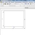 How to build a graph in Mathcad?